Rocket Shape
Symbolizing power, progress, and upward momentum. The upward curve mimics a rocket tip launching forward, representing fast, cutting-edge internet.
 RELIX
Logo Design · Brand Identity · UI Concepts
Logo concepts, brand identity, and UI layout presentation.
A complete logo presentation exploring speed, connection, and innovation through two icon directions, brand colors, typography, and light and dark interface concepts.
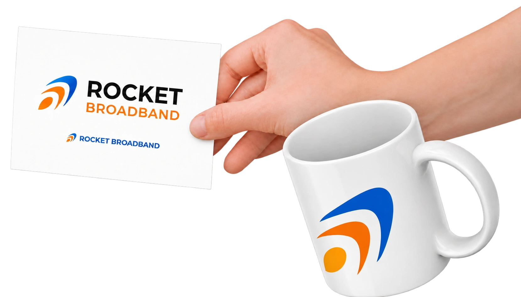
This logo was designed to represent speed, connection, and innovation, all core qualities of the Rocket Broadband brand. It was created specifically based on the client’s brief, which emphasized a modern, clean, and visually dynamic identity that reflects fast and reliable internet service.
The main icon is a combination of two key elements:
Symbolizing power, progress, and upward momentum. The upward curve mimics a rocket tip launching forward, representing fast, cutting-edge internet.
The three curved lines resemble a wireless signal icon, conveying strong, high-speed connectivity. These also suggest data flow or fiber broadband waves.
This multi-layered symbol is simple yet meaningful, giving the brand a futuristic, professional, and approachable visual identity.
To align with the brand’s goals of speed, simplicity, and innovation, I created two distinct versions of the logo — both using the same color scheme (blue and orange) and fonts (Montserrat for the logo, Inter for supporting text), but with different icon structures:
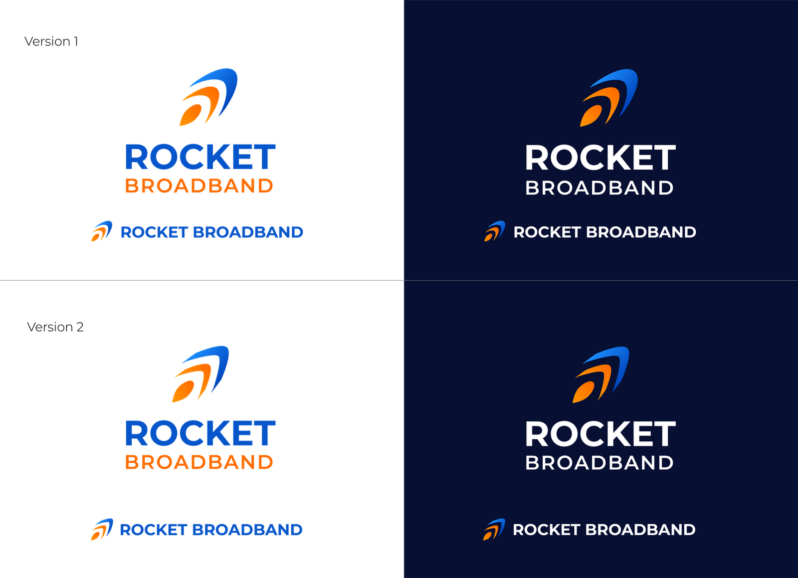
This version features a smooth, upward curve forming the top of the icon:
In this version, the icon has a sharper, more defined rocket tip:
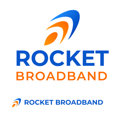
#0655CB#1E9FF0#FF6B00#FF8800#00000#071033#061961#70738CFor Logo Font: Montserrat — Bold, geometric, and modern; fits tech and digital services
Body Font: Inter — Highly legible on all devices, clean and professional for UI use
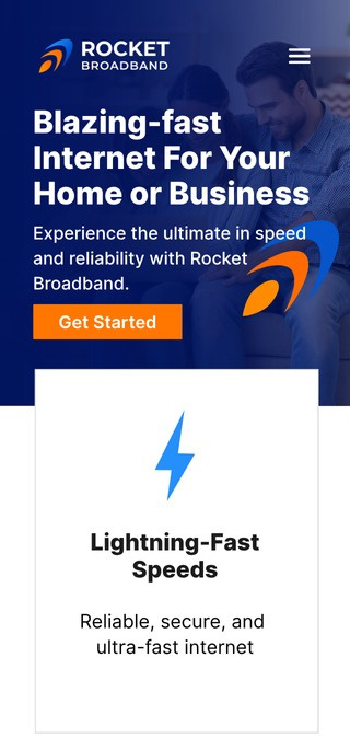
Clean and approachable, balancing professionalism with accessibility for wider audiences.
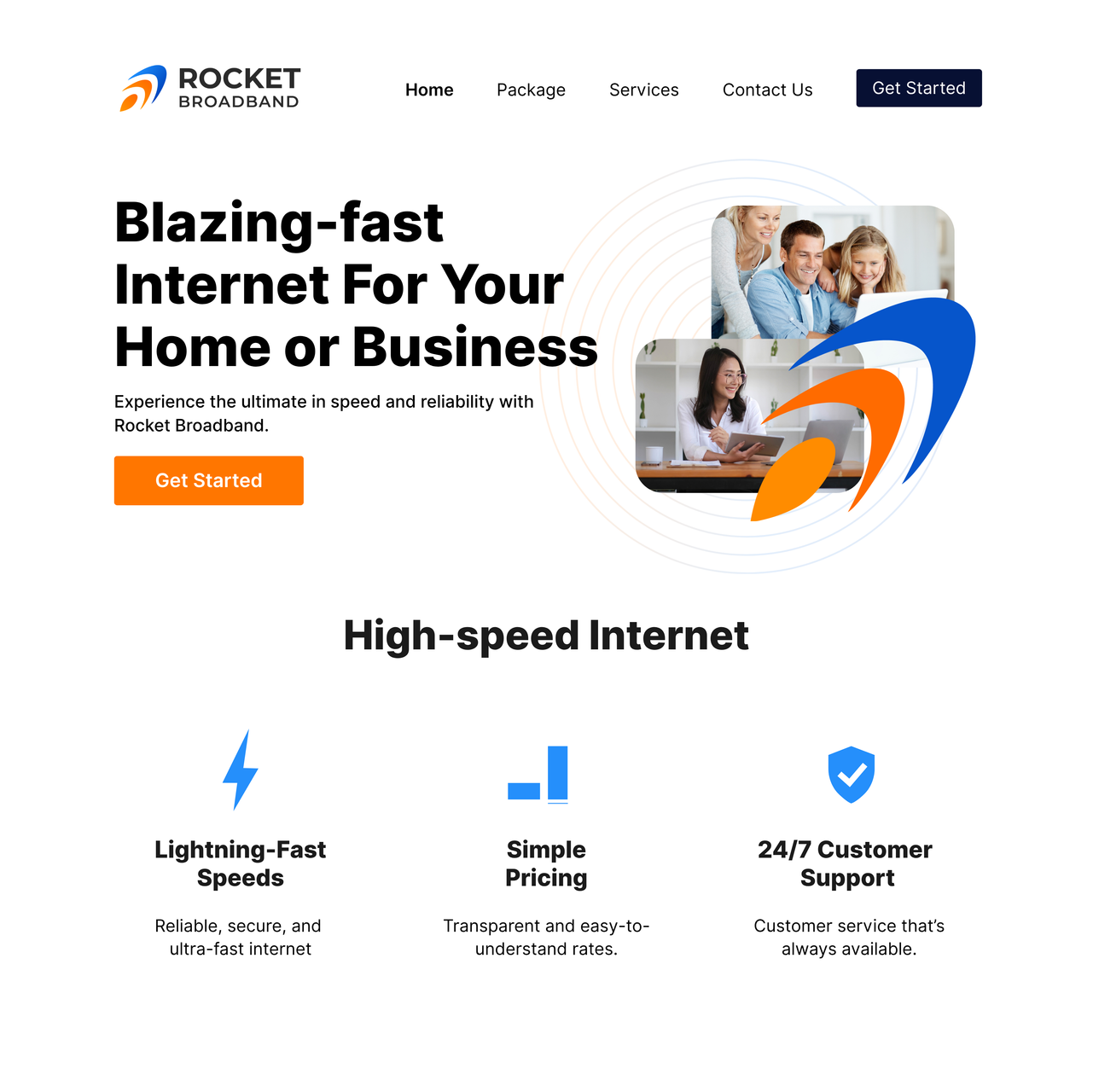
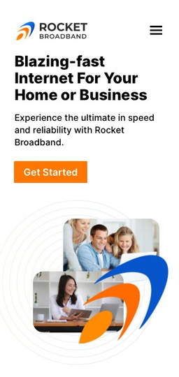
Strong contrast with white text and bold CTAs. Ideal for high-impact impressions and modern tech vibes.
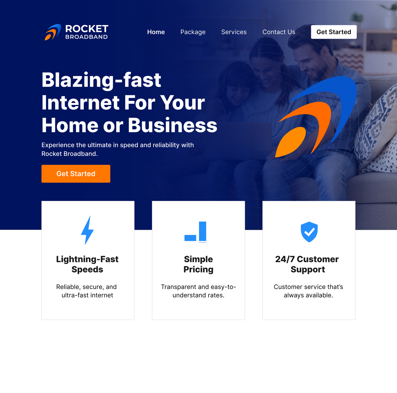
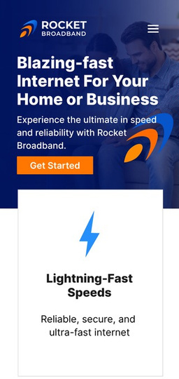
Let’s discuss your logo, brand direction, and the visual materials your business needs.
Discuss your project